
Optichromie
2014 — en curso · en el registro del estudio: 2014–hoy
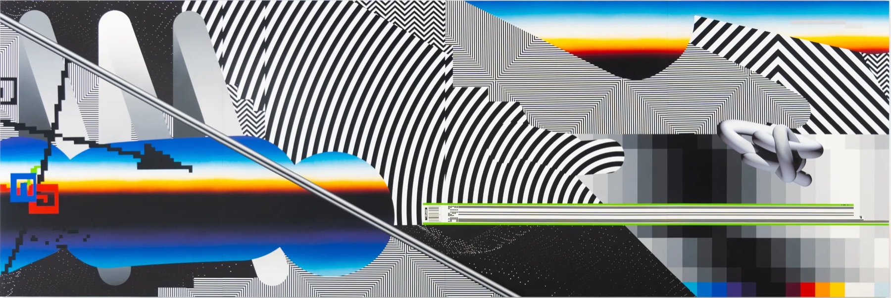
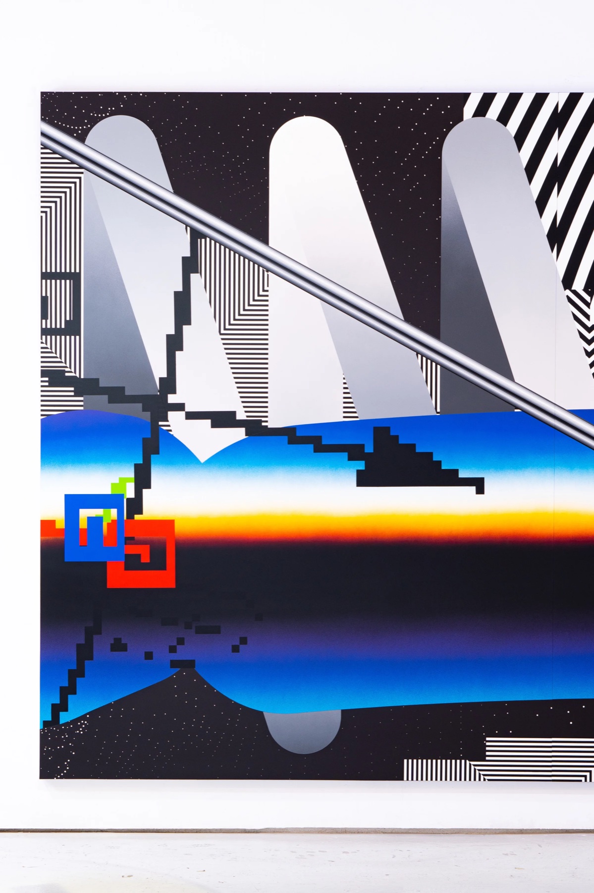
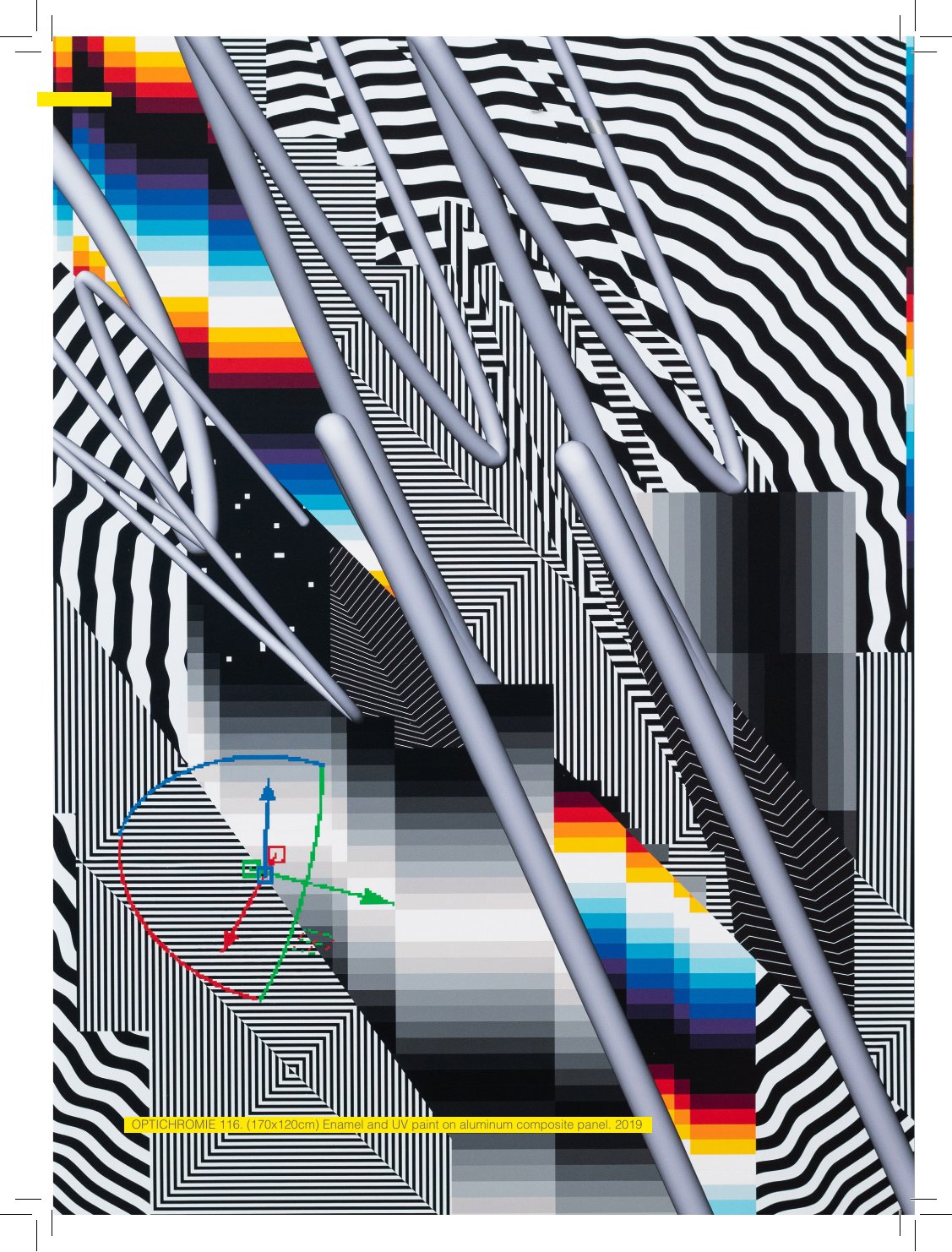
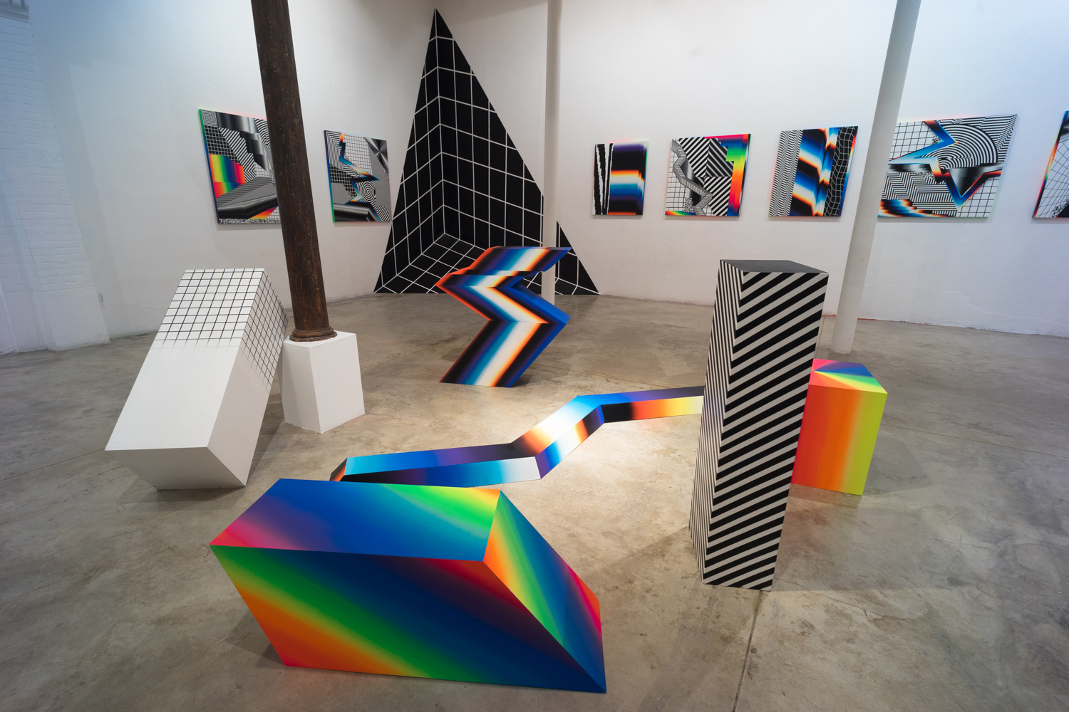
La primera serie posterior al lettering: campos op-art en blanco y negro — retículas, anillos de moiré, franjas QR, ruido glitch — yuxtapuestos a degradados de color de saturación máxima. El nombre es un homenaje declarado a las Physichromies de Carlos Cruz-Diez.
OPTICHROMIE 1 (2014, esmalte sobre lienzo, 80×80 cm) marca el desprendimiento de la letra como elemento de composición. El soporte cuenta la historia material del estudio: lienzo y madera al principio; desde 2016, panel composite de aluminio con marco de aluminio — su soporte de firma. Es también su serie insignia en la calle: de Buffalo a Fuenlabrada, hasta su obra más grande, OPTICHROMIE for Jersey City (2024, 25 plantas).
técnica — esmalte y pintura UV sobre panel composite de aluminio · antes esmalte sobre lienzo y madera (2014–16)
“I needed my graffiti to stand out amongst other graffiti writers. I increased the contrast in my pieces (pictorially) so I ended up using only black and white op-art kind of elements juxtaposed to the most saturated colors. At some point I got rid of the letters of my graffiti name and I started doing abstract compositions. I titled them “Optichromies” as an homage to the master's Cruz-Diez' Physichromies.”
¿Tienes una obra de esta serie? El registro la verifica por código de inventario o título, una a una.